3 min read
I recently stumbled across a study by Vanguard that summarized the historical returns of various stock/bond portfolios from 1926 to 2017. Fortunately, Vanguard researchers did the heavy lifting by collecting and aggregating all of the historical data. Unfortunately, they didn’t make any cool graphs using the data.
So, here are some cool graphs that summarize their findings.
Returns by Allocation
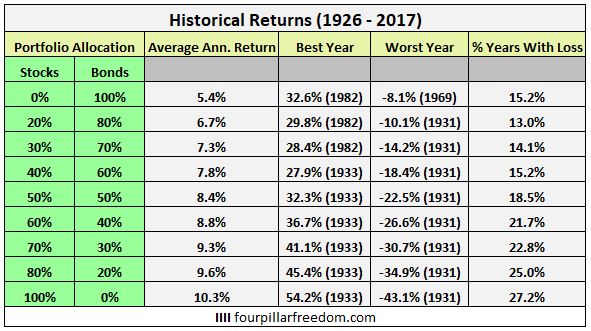
The following table shows the average annual return, the best year, the worst year, and the percentage of years that incurred a loss for different portfolio allocations:

This table tells a simple tale: Portfolios with higher stock allocations have experienced higher annual returns and higher volatility. Conversely, portfolios with higher bond allocations have experienced lower annual returns and lower volatility.
Annual Returns by Allocation
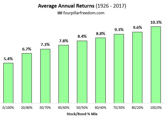
The chart below shows the average annual returns for different portfolio allocations:

Historically, the higher your stock allocation, the higher your average annual returns have been. But keep in mind that a higher stock allocation comes with higher volatility, as the next chart illustrates.
Best and Worst Years by Allocation
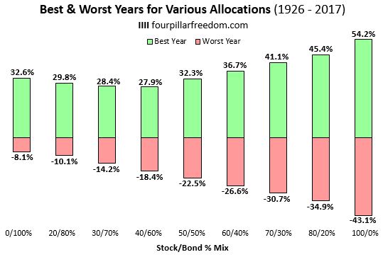
The chart below shows the best and worst years for various allocations.

During the best year in 1933, a 100% stock portfolio increased by 54.2%. But just two years prior in 1931, a 100% stock portfolio got crushed and lost 43.1%. Talk about volatility.
On the other end of the spectrum, a 100% bond portfolio experienced its best year ever in 1982 with a 32.6% increase. And during the worst year ever, a 100% bond portfolio only dropped by 8.1%.
% Years with Gains vs. Losses by Allocation
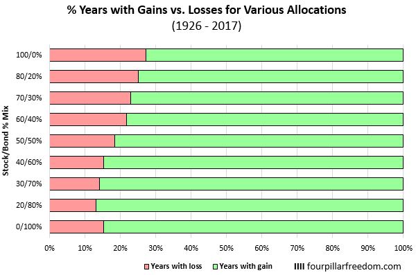
The chart below shows the percentage of years that experienced gains vs. the percentage of years that experienced losses based on allocation:

A portfolio that held 100% bonds experienced losses in 15.2% of all years (14 out of 92 years) since 1926.
Conversely, a portfolio that held 100% stocks experienced losses in 27.2% of all years (25 out of 92 years) since 1926.
The Big Picture
These charts preach a simple message: The higher your stock allocation, the higher your expected return and the higher your expected volatility. The higher your bond allocation, the lower your expected return and the lower your expected volatility.
Based on your financial goals and your appetite for risk, you should adjust your portfolio allocation accordingly.
All of the charts in this post were made using Microsoft Excel. Find out how to make similar charts using The Excel Genius Toolkit.
Technical Notes: Here is how Vanguard calculated stock and bonds returns for this analysis:
“For U.S. stock market returns, we use the S&P 90 Index from 1926 through March 3, 1957; the S&P 500 Index from March 4, 1957, through 1974; the Dow Jones U.S. Total Stock Market Index (formerly known as the Dow Jones Wilshire 5000 Index) from 1975 through April 22, 2005; the MSCI US Broad Market Index from April 23, 2005, through June 2, 2013; and the CRSP US Total Market Index thereafter.
For U.S. bond market returns, we use the S&P High Grade Corporate Index from 1926 through 1968; the Citigroup High Grade Index from 1969 through 1972; the Lehman Brothers U.S. Long Credit AA Index from 1973 through 1975; the Bloomberg Barclays U.S. Aggregate Bond Index from 1976 through 2009; and the Bloomberg Barclays U.S. Aggregate Float Adjusted Index thereafter.”
- The Ad Revenue Grid - August 6, 2021
- Attract Money by Creating Value for a Specific Audience - July 13, 2021
- The 5-Hour Workday - March 26, 2021
Full Disclosure: Nothing on this site should ever be considered to be advice, research or an invitation to buy or sell any securities, please see my Terms & Conditions page for a full disclaimer.

Compelling and useful data as always, Zach. These percentages don’t include (reinvested) dividends, do they? I’d be curious to see how that changes the numbers. Similarly, and in combination with the dividends, how would various percentage contributions ((1) lump sum, perhaps on Jan. 1, and (2) monthly DCI) change the yearly percentage increase/decrease.
Thanks, Joe! You’re correct, the numbers don’t include reinvested dividends. And lump sum vs. monthly investments would change the numbers slightly, unfortunately Vanguard didn’t dive that deeply into the data.