
4 min read
The U.S. makes up about half of the total world stock market cap. The countries around the world that compose the other half of the total market cap are broken down into three categories by MSCI:
- Developed markets
- Emerging markets
- Frontier markets
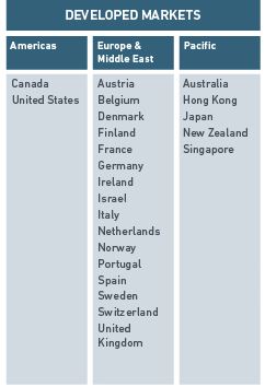
Today I take a look at how the stock market has performed in the 23 countries in the Developed markets category. This includes the United States, Canada, a boatload of European countries, Israel, Hong Kong, Japan, Singapore, Australia, and New Zealand.
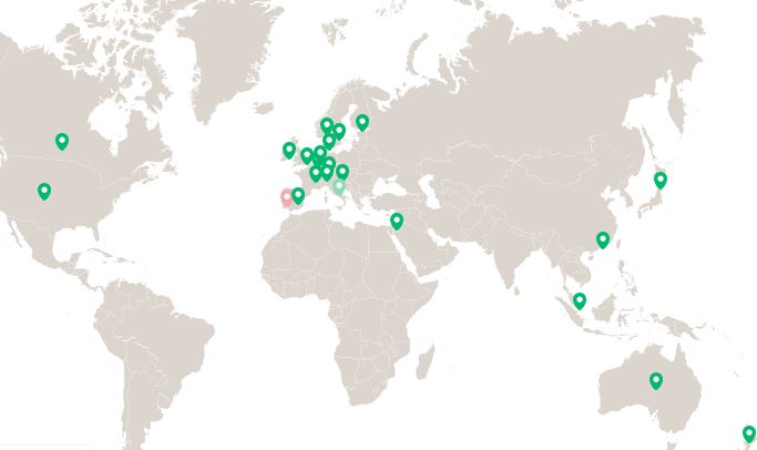
Here’s where these countries are located on a map:
Let’s dive in!
Visualizing Stock Market Returns By Country
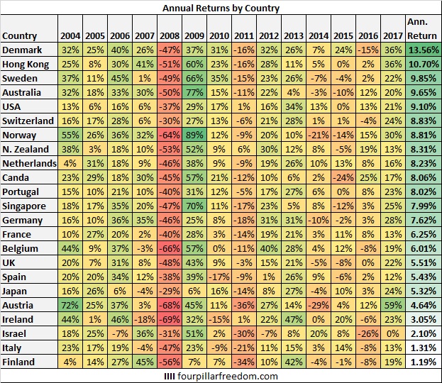
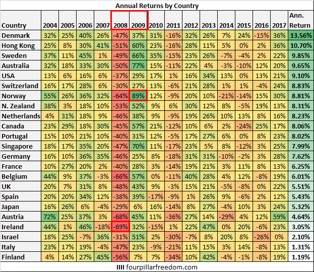
Here are the annual returns of each country’s total stock market index since 2004:
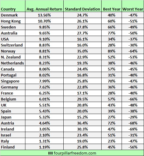
And here is a summary of the annual returns:
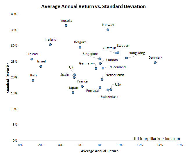
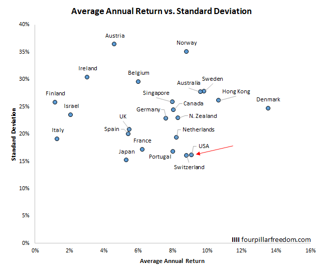
The scatterplot below shows the average annual return vs. the standard deviation for each country:
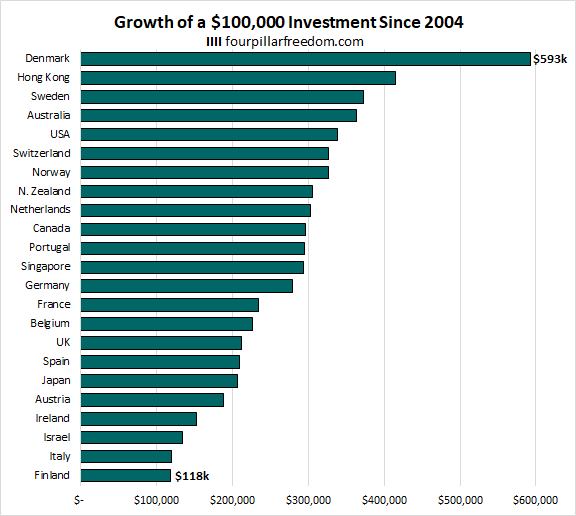
The bar chart below shows what a $100,000 investment in each country’s total stock market index would have grown to by the end of 2017:
Some Interesting Observations
Every country experienced negative returns during the financial crisis in 2008 and positive returns in the following year in 2009. Among these countries, Ireland experienced the worst drawdown in 2008 (-69%) and Norway experienced the strongest recovery in 2009 (+89%):
Austria experienced the most volatility during this time period, while Japan experienced the lowest:
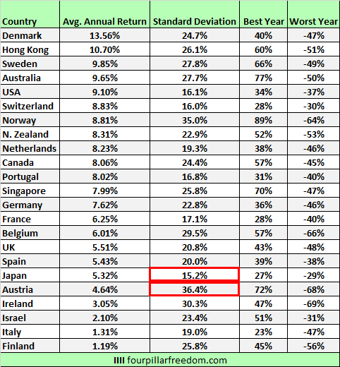
Although the U.S. experienced lower annual returns than Australia, Sweden Hong Kong, and Denmark, it had considerably lower volatility:
A $100,000 investment in Denmark’s total stock market index would have grown to an incredible $593k. The same investment in Finland’s total stock market index would have grown to a pathetic $118k. An investment in any country’s index would have at least doubled in value, except for Finland, Italy, Israel, and Ireland.
Note to self: Don’t invest in countries that start with the letter “I”

Conclusion
It’s important to keep in mind that this data only covers 14 years (that’s the latest MSCI provides data for), which is a relatively short time frame in the grand scheme of things.
If you do choose to invest in the U.S. in a total stock market fund, just know that you are gaining exposure to roughly half of the world’s market cap. In addition, virtually every U.S. company does significant business overseas, which increases diversification.
As we saw, sometimes you can’t escape market downturns like 2008 no matter where you choose to invest your money. Since the world is more connected than ever through technology, a financial crisis has the potential to impact not just one country, but many.
Also, as we see in most studies, stocks tend to increase over long time frames. As we saw with these charts, even an investment in the worst-performing country increased in value during this 14-year-period. For patient long-term investors who are willing to embrace volatility, investments in stocks tend to increase significantly over time.
Thanks for reading 🙂
- The Ad Revenue Grid - August 6, 2021
- Attract Money by Creating Value for a Specific Audience - July 13, 2021
- The 5-Hour Workday - March 26, 2021
Full Disclosure: Nothing on this site should ever be considered to be advice, research or an invitation to buy or sell any securities, please see my Terms & Conditions page for a full disclaimer.
