2 min read
It’s difficult to predict which asset classes will perform best from one year to the next.
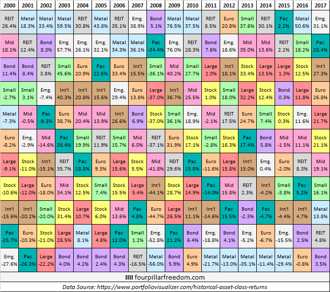
To illustrate just how difficult it is to predict, check out the grid below which shows the annual returns of 11 different asset classes sorted from best to worst returns for each year since 2000:


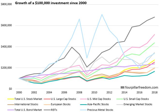
The chart below shows the growth of a hypothetical $100,000 investment in each asset class since 2000:
![]()

Some Interesting Observations
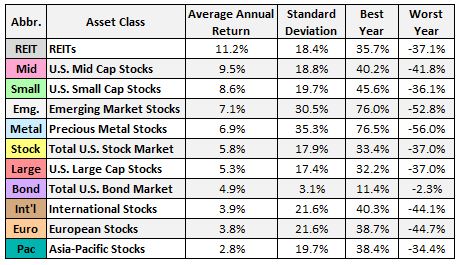
- Precious metal stocks had the highest annual volatility by far, followed by emerging market stocks
- Precious metal stocks were either in the top two highest or bottom two lowest returns by asset class for 17 out of the 18 years
- Precious metal stocks experienced the highest single year loss of any asset class in 2008 (-56%) and the highest single year gain of any asset class in 2009 (76.5%)
- Precious metal stocks were the best performing asset class from 2000 to 2013
- The total U.S. bond market only experienced one year of negative returns (-2.3% in 2013)
- The total U.S. bond market easily outperformed International stocks, European stocks, and Asia-Pacific stocks during this time period with far less volatility.
- REITs were in the top two asset class returns in 8 out of the 18 years.
- A $100,000 investment in REITs as an asset class in 2000 would have grown to $680,000 by the end of 2017.
- A $100,000 investment in Asia-Pacific stocks as an asset class in 2000 would have grown to only $165,000.
- Not including bonds, U.S. large cap stocks experienced the lowest volatility during this time period.
- U.S. large cap stocks, International stocks, and the total U.S. stock market were never in the top two performing asset classes in any year.
- Emerging market stocks and precious metals experienced the biggest losses in the crash of 2008, but subsequently experienced the biggest gains in 2009.
- U.S. Mid Cap stocks outperformed U.S. Small Cap stocks and did so with lower volatility.
- The total U.S. bond market was the only asset class to experience positive returns during the crash of 2008.
- The total U.S. bond market outperformed the total U.S. stock market from 2000 to 2016.
All of the charts in this post were made using Microsoft Excel. Find out how to make similar charts using The Excel Genius Toolkit.
- The Ad Revenue Grid - August 6, 2021
- Attract Money by Creating Value for a Specific Audience - July 13, 2021
- The 5-Hour Workday - March 26, 2021
Full Disclosure: Nothing on this site should ever be considered to be advice, research or an invitation to buy or sell any securities, please see my Terms & Conditions page for a full disclaimer.

Another awesome visualization, with equally awesome data.
Super surprising to see REITs do so well. I’ll admit to having a mostly REIT dominant portfolio early in my quest to build it out in order to chase some yield, but nice to see that it might not be such a bad way to go.
I was also surprised at how well REITs performed over the years, and I share your sentiment for enjoying REIT yields. It offers a nice income stream no matter how the market is behaving.
I’m surprised to see U.S. stock market at 5.8%. I figured it would average at the 7-8% range as we see in articles so often.
The U.S. stock market really got crushed in 2000, 2001, 2002, and 2008, which explains the sub-par performance. For a longer time horizon (like if data started in 1990), the performance of stocks would look much better.
Great job, Zach!
I wouldn’t had guessed that REITS were the best performing asset class. But I guess it makes sense given the dot com bust, 9/11, and then the great financial crisis.
I wonder what this means next 17 years?
The one thing that is misleading about this kind of view is that it doesn’t show what investors actually earned because it can’t. But if you accept that most people are dollar cost averaging into investments actual returns can/will deviated greatly from these returns.
Thoughts?
Dom
You make a good point Dom – since this analysis assumes you invest the same amount at one fixed time point (2000), it can be a bit misleading. I’m looking at doing another analysis that includes dollar cost averaging to see how things shook up if investors had invested consistently each year. Thanks for the feedback!
I like how you make lots of data more simplified for the masses. I remember one of your income v saving % green, yellow, red grid table got retweeted around many times.
Gotta love them realty classes esp in market volatilities like these days. At least if everything went to hell I still got a roof for me and my family to live under.
Thank you! I appreciate the kind words. I think data visualizations are a great way to simplify lots of numbers into easy-to-digest charts.
Wow – great visual. That gives such food for thought. Now to mull it all over…
Thanks Lin! Glad you enjoyed the visual 🙂
nice visuals. i had a suspicion about mid-caps outperforming small and large in the u.s. successful mid-caps have room to grow and run and become large caps. what did you use for a reit index going back that far?
I got the data from here: https://www.portfoliovisualizer.com/historical-asset-class-returns, and according to their site they use VGSIX for the historical REIT returns.