
4 min read
One summer morning two years ago, I was listening to a podcast interview with financial writer and blogger Jim Collins. At one point in the interview, the host Farnoosh Torabi asked Jim the following question:
Farnoosh: “So fill in this blank: if I won the lottery tomorrow, let’s say a hundred million bucks, the first thing I would do is _______”
Jim: “I’d put it in VTSAX and…”
Farnoosh: “Really? All of it?”
Jim: “Oh absolutely, I would put a hundred percent of it in VTSAX. Currently I’m fully retired so I would invest it and draw down on it. And if I were younger I would invest it and just let it ride.”
For those who don’t know, VTSAX is the ticker symbol for the Vanguard Total Stock Market Index Fund (Admiral shares). Jim tells Farnoosh that if given $100 million, he would invest all of it in this index fund.
At his current age, he says he would “draw down” on it, meaning he would ocassionally sell shares in exchange for cash to support his lifestyle. And if he were younger, he explains, he would “let it ride” meaning he would let the shares sit in his account without selling them and let them grow over time.
This interview took place in June 2016 when the price of one share of VTSAX was about $51, which was sitting close to all-time highs.
When I first heard this interview, I remember thinking to myself, “That sounds risky to invest a windfall of money in VTSAX when prices are at all-time highs. I like the idea of investing in a total stock market index fund, but I think I would personally wait for prices to drop.”
Now, just over two years later, the price has risen to about $73 per share.
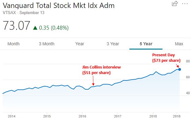
We would need to experience a massive 30% drop at this point just to see the price get back to $51 per share.
This brings up an interesting question: Since the market hit all-time highs in 2016, it has continued to grow tremendously since then. But is this always the case? Does the market always perform well even after hitting all-time highs?
Lucky for us, one of my favorite new bloggers over at Engaging Data created an interactive visualization that illustrates how the market has historically performed once it has hit all-time highs.
In his own words:
“The graph below shows two histograms plotted together. The first histogram (in blue) shows the distribution of returns for the S&P500 over a specified period (one week to ten years) for every single day between 1950 and 2018 (68 years). The second histogram (in orange) shows a similar distribution of returns for the S&P500 but only from days in which the S&P500 index was at an all-time-high (i.e. the index was higher than any previous day). There have been approximately 1200 days where the index was at an all-time-high, out of the more than 17000 market trading days since 1950.”
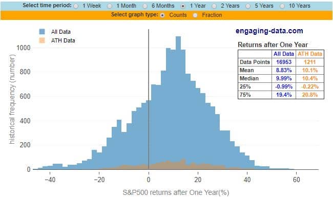
What’s particularly interesting to me is the box in the top right corner of the graph, which shows the mean and median returns of the market based on whether or not it was at an all-time high.
For example, in the graph we see that on days when the market is at an all-time high (“ATH Data”), the median return over the following one-year period is 10.4%. Contrast that with all possible days when the median return over the following one-year period is only 9.99%.
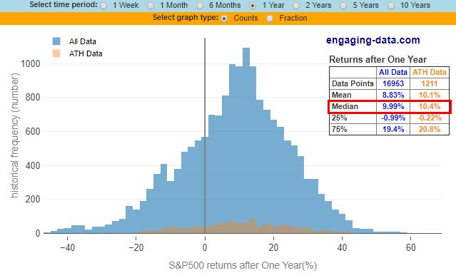
Wait, the market performs better over the coming year if it’s at an all-time high? Intuitively this didn’t seem right to me at first, but the more I thought about it the more it made sense.
The stock market tends to go up far more often than it goes down. In any given year, prices are likely to be higher a year later. Looking at a chart of the S&P 500 since 1950 confirms this:
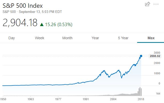
So, even when prices are at all-time highs, they’re likely to be even higher a year later.
But what if we look at longer time horizons? For example, how does the market perform over five-year periods once it hits an all-time high?
Changing the time period to five years on the interactive graph, we see that during all days when the market was at an all-time high, the median total return over the following five years was 46.5%, compared to 47.9% for all possible days.
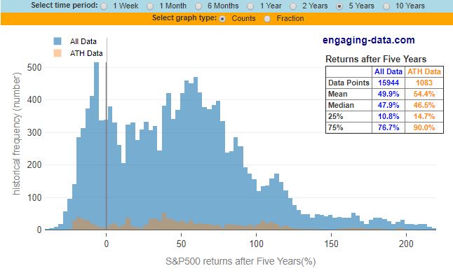
And changing the time period to ten years reveals that during all days when the market was at an all-time high, the median total return over the following ten years was 108.1%, compared to 100.2% for all possible days.
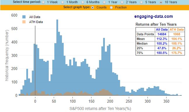
These graphs tell a simple tale: even when the stock market is at an all-time high, you can expect about the same returns (sometimes even better returns) going forward as you can when the market is not at an all-time high.
The reason for this is that all-time highs in the market are typically followed by more all-time highs. This is the nature of the stock market.
The Takeaway
Even after seeing this data, it’s natural to feel hesitant about investing in stocks in late 2018. Despite the raw data, your gut is probably still telling you to wait for prices to drop.
One way to combat this feeling is to simply put a plan in place to invest on a consistent basis, no matter what the market is doing. Personally I invest around $1,000 – $3,000 in total stock market index funds every single month no matter the price.
Over the course of years and decades, this will ensure that I take part in the long-term gains of the market. This doesn’t mean it will be a smooth ride. The market will drop during some years, sometimes significantly, but I view drops as buying opportunities.
So, if you’re sitting on the sidelines waiting for prices to drop before you invest, you could be waiting longer than you think. In fact, it’s possible that prices may never be this low again, even though we’re sitting at all-time highs. The data tells us that all-time highs are nothing to be feared. Because more often than not, all-time highs are followed by more all-time highs.
- The Ad Revenue Grid - August 6, 2021
- Attract Money by Creating Value for a Specific Audience - July 13, 2021
- The 5-Hour Workday - March 26, 2021
Full Disclosure: Nothing on this site should ever be considered to be advice, research or an invitation to buy or sell any securities, please see my Terms & Conditions page for a full disclaimer.

Great article. I was just thinking about this yesterday! Wondering it its a good idea to invest cash still, or wait on the sidelines for a market correction. Because of this great post, I’m taking to the books to find my next buy.
Thanks for the informational post FPF.
Glad you found the article valuable, Dr. Dividend!
What’s interesting is how both the S&P and DJIA were relativity calm and low growth until 1995. S&P started to pick up a little sooner. I pulled DJIA out to 1920
Great article Zack, with good evidence. Still, we are in new territory.
If Millennials are planning for retirement 30-40 years from now, they should know the stock market has never cut a loss over any 20-year period from 1926–2015.
The odds of realizing a positive stock return are 100% over any 20-year period during that timeframe. Let me repeat. Stocks have never seen a loss over any 20-year time period from 1926-2015. Never. Not once.
But what about over shorter intervals, you ask? How about 10 years? A sobering 94% of the time there was a gain. 5 years? 86%. I don’t know about you, but I’ll take those odds if my alternative is holding cash in a checking account.
To illustrate, if you had the misfortune of buying an S&P 500 index fund the Friday before Lehman Brothers went bankrupt you would’ve lost 46% over the next 6 months. On the other hand, if you bought that day but never sold, you’d be up 185% as of last week.
Compelling reasons to buy and hold.
It’s hard to deploy money sometimes when the PE ratios are so high. Ofcourse I’m continuing with large sums into my 401k. I guess the psychology kicks in when the market is bad one day and then I deploy funds into an after-tax account.