
3 min read
There’s one metric in personal finance that is more important than any other: savings rate. This represents what percentage of your income you save. The higher your savings rate, the faster you can reach financial independence or whatever financial goal you happen to have.
In order to increase your savings rate, you first need to have an idea of where your money is flowing on a regular basis. Once you know the path your money takes from earning income to paying bills to making investments, you’ll be in a position to identify how you can increase your savings rate.
One helpful way to visualize your money flow is with a financial map. This is a simple “map” that outlines where your money travels on a regular basis.
Here’s my own financial map:
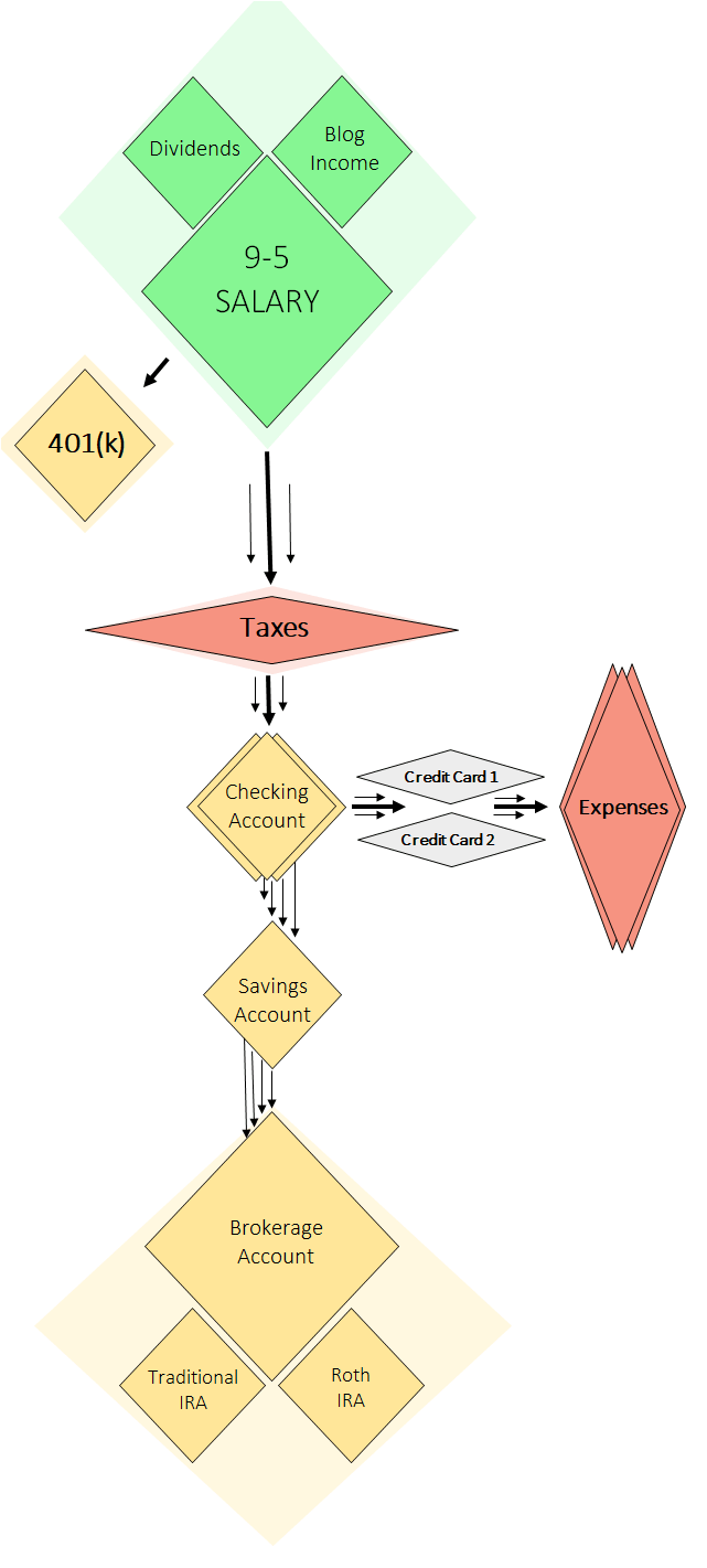
My financial map has three phases: income, expenses, and savings. I earn income, pay for my expenses, and save whatever is left. My goal is to get as much money from the green diamonds (my income) at the top of the map into the beige diamonds (my savings & investment accounts) throughout the map.
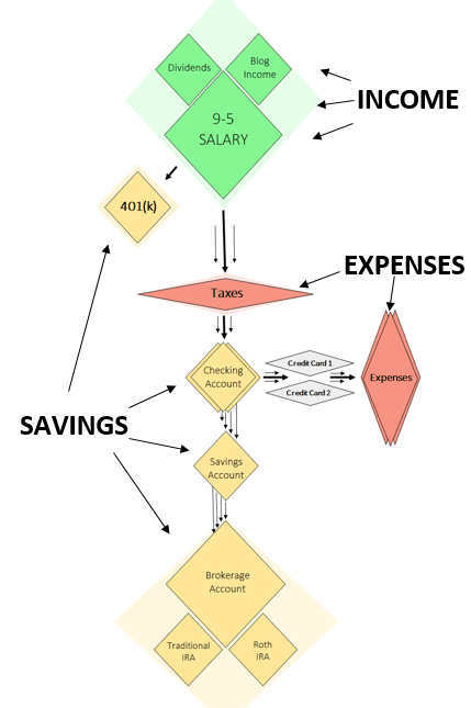
Here’s a detailed description of each phase in the map.
Phase 1: Income
Income streams, taxes, and 401(k) accounts
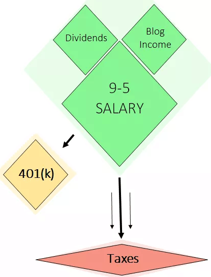
Every two weeks I receive a paycheck from my employer. First my 401(k) contributions are deducted from my paycheck, then I pay income taxes on the rest.
At the start of each month I also receive payments from my blog advertisement group and affiliate partners. I pay taxes on this income as well.
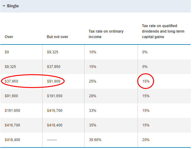
Lastly, I receive dividends in my brokerage account from a variety of sources including REIT’s, individual stocks, and index funds. These dividends are taxed at a marginal rate of 15%, since I’m in the $37,950 – $91,900 income tax bracket:
Phase 2: Expenses
Checking accounts and credit cards
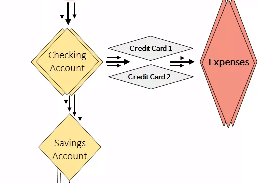
Once I pay all my taxes to Uncle Sam and make my 401(k) contributions, my remaining income lands in my checking account. At this point, I pay off my credit card bills since I use credit cards for virtually all of my expenses. I use Fidelity’s 2% Cash Back card and typically some other rewards credit card solely to earn travel rewards points.
Related: Check out this post from Luxe Strategist on how she uses credit cards to earn travel rewards.
After I pay my bills, I only like to keep around $1,000 in my checking account since it earns basically nothing in interest. I transfer anything extra to my savings account that currently earns 1.25% annually in interest.
Phase 3: Savings
Savings and investment accounts
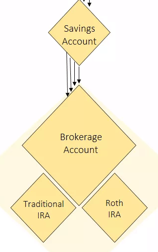
I like to keep around $4k – $7k in my savings account at any given time. When this account balance gets too large, I invest some cash in REIT’s, index funds, or on rare occasions individual stocks.
I try to invest on a regular basis to avoid the temptation of market-timing. Most of these investments are made through my brokerage account, although I do have a Traditional IRA and Roth IRA that I opened in my early years of college.
The Benefits of a Financial Map
Creating a financial map like this is helpful in understanding exactly where my money flows on a regular basis. It also ensures that I have a system in place that forces me to save a high percentage of my income.
My rules of thumb for maxing out my 401(k), only keeping $1k in my checking account, only $4k – $7k in my savings account , and investing the rest helps optimize my money flow.
I encourage you to make your own financial map so you can visually see exactly where your money flows on a regular basis. If you do make your own map and see that it’s more complicated than you thought, that could be a sign that you need to simplify your finances through consolidating accounts, closing certain credit cards, or moving all your investment accounts to one brokerage.
My favorite free financial tool I use is Personal Capital. I use it to track my net worth, manage my spending, and keep an eye on my monthly cash flow. It only takes a few minutes to set up and it makes tracking your finances simple and easy. I recommend trying it out.
You can also sign up to have my most recent articles sent straight to your email inbox for free ?
[jetpack_subscription_form subscribe_text = “” title=””]
- The Ad Revenue Grid - August 6, 2021
- Attract Money by Creating Value for a Specific Audience - July 13, 2021
- The 5-Hour Workday - March 26, 2021
Full Disclosure: Nothing on this site should ever be considered to be advice, research or an invitation to buy or sell any securities, please see my Terms & Conditions page for a full disclaimer.

Fun read! I was wondering why diamonds were the header photo.
Thanks, Lily! Glad you enjoyed it 🙂
Awesome charts for breaking down your money flow! Also thank you for sharing up front in BOLD the most important step in reaching financial freedom – SAVINGS RATE…You can’t invest money that you didn’t originally save.
Great post!
Thanks, Sean! That’s right – savings rate is the metric everyone should be focused on most in personal finance 🙂
Very cool visuals! I wrote out my money map a few months back, really helpful exercise to be able to visualize how everything flows: https://www.spillsspot.com/finance-blog/2017/09/11/money-map/
Looks like both of ours are very simple, which keeps everything well organized.
Do you calculate your savings rate based on your after-tax income? So 401k contributions + other savings&investments / after-tax income = savings rate? I’m always confused about whether I should add in pre-tax 401k contributions into the total income number or not.
Thanks for sharing the link to your map!
Yes, I calculate savings rate based on after-tax income. This is my personal preference, but I have seen people calculate it using gross income. I don’t think there’s a “right” or “wrong” way to do it, just so that you’re consistent over time so you can compare your savings rate against past savings rates to track your progress.
Nice post! I like how simplified your map is–mine was pretty chaotic 🙂 It’s awesome you were woke to IRAs in college and started early. And thanks for sharing my post!
Thanks, Luxe! Your map was more detailed than mine, so I actually liked yours more in that regard. And not a problem, happy to share it! 🙂
Nice info graphics. Love the financial map.
Thanks! Glad you found it useful 🙂
Nice post; I also enjoyed the mapping.
It’s a great exercise to do.
Thanks, Mike! It is a great exercise, I encourage everyone to create their own map.
Nice set up! I like seeing how different people manage their money flow 🙂
Thanks so much! 🙂
I love posts like this! It’s so interesting to see where someone’s money goes! Last year, I was inspired by The Luxe Strategist to make my own money map. Even though I’ve always been responsible with finances, it was pretty eye-opening to see just how much of my income goes to taxes! Visually seeing my cash flow helped me figure out where I was being inefficient with my money and where I could make optimizations.
I also got the idea for this post after seeing Luxe’s own financial map. You’re right, it’s pretty incredible to realize just how much most of us pay in taxes. For most people, they actually pay more in taxes than they save from each paycheck. It’s great to hear that creating a financial map was so beneficial for you as well 🙂