This morning I woke up with a thought in my head:
I wonder how much money I have spent so far this year?
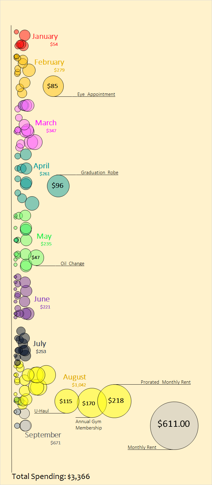
So I hopped online, downloaded all my credit card statements for the entire year, and made a nifty chart in Excel. The results are shown below.
Each circle represents one transaction. The bigger the circle, the more money I spent. The color of the circle represents the month. As you can see, my expenses in August and the first few days of September are noticeably higher than all the previous months because I moved into my own apartment in the middle of August which added rent, utilities, and groceries to my monthly bills.
I think it’s neat to look at this chart and see where and when money was leaving my wallet throughout the year…

So far this year I have spent a total of $3,366, which is absurdly low only because I was living with my parents for the first eight months and only had a monthly car and phone payment to make. All other expenses were pretty much discretionary (cough cough, Chipotle). I plan on remaking this chart at the end of the year to visualize an entire year of expenses in one chart. Stay tuned for that!
Thanks for reading, hopefully you enjoyed this visual 🙂
My favorite free financial tool I use is Personal Capital. I use it to track my net worth, manage my spending, and keep an eye on my monthly cash flow. It only takes a few minutes to set up and it makes tracking your finances simple and easy. I recommend trying it out 🙂
You can also sign up to have my most recent articles sent straight to your email inbox for free ?
[jetpack_subscription_form subscribe_text = “” title=””]
- The Ad Revenue Grid - August 6, 2021
- Attract Money by Creating Value for a Specific Audience - July 13, 2021
- The 5-Hour Workday - March 26, 2021
Full Disclosure: Nothing on this site should ever be considered to be advice, research or an invitation to buy or sell any securities, please see my Terms & Conditions page for a full disclaimer.

Wow, that’s amazing! That spend is soooo low, I love it! Definitely pays off to find ways to lower housing costs. Good luck with the new apartment!
My expenses will definitely be higher moving forward but hopefully I can keep my spending in check. Thanks for the kind words 🙂
Cool! Did you use a special software to make this? I wish my expenses were this low. Things (ummm expenses change with marriage and kids) 🙂
I actually just used basic Excel, it’s pretty incredible how much you can customize graphs with specific colors, fonts, labels, etc. And my expenses have been ridiculously low so far this year mainly just from living with my parents…so it’ll be interesting to track my spending in the next coming months 🙂
Hey Zach,
Thanks for sharing another one of your great visuals! And wow! I can only dream of being able to keep my spending this low. That’s like less than 2 months worth over spending for me over here in Toronto, and I don’t even have car. I guess the last time I could’ve spent this little by this point in the year was before school when I was living at home. It’s great that you’ve been able to take advantage of the situation and do the right thing with your money. I wasted my money while I was at home. Looking forward to seeing your total for the year!
Thanks for the kind words, Graham! Living at home definitely makes saving money ridiculously easy. I was grateful that my parents let me stay at home for so long and get such a head start on my finances, it’s something I don’t take for granted. Looking forward to sharing my total annual spending later this year 🙂