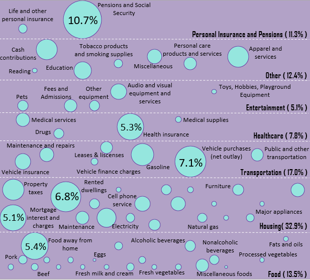
Each year the Bureau of Labor Statistics conducts a Consumer Expenditures Survey, which is a massive survey of hundreds of thousands of American Households to find out exactly what Americans are spending their money on each year.
Here are the results of the most recent survey (2015), which shows what the average American household spends on various categories as a percentage of total spending:

You can find the data I used for this visualization here.
Latest posts by Zach (see all)
- The Ad Revenue Grid - August 6, 2021
- Attract Money by Creating Value for a Specific Audience - July 13, 2021
- The 5-Hour Workday - March 26, 2021
Full Disclosure: Nothing on this site should ever be considered to be advice, research or an invitation to buy or sell any securities, please see my Terms & Conditions page for a full disclaimer.

Honestly, I’m surprised at how low the education costs are. Maybe it’s because we tend to just pay the minimums each month? Hm.
That was my initial thought as well. It’s only based on yearly spending and it’s also the AVERAGE amount spent by American households. There are plenty of households who have no education costs, which could be dragging down the average.
Makes sense for the most part. Other, transportation and food are ones which variably have the most potential of being adjusted 🙂
It’s nice to see pensions and social security being one of the highest though.
I had similar thoughts – transportation and food costs are two huge areas where frugality can have a massive benefit.
I’m a visual person and I love how you translate so many of the fundamentals of Personal Finance and Financial Independence into graphs, charts, etc 🙂
Thanks so much, Mrs. Adventure Rich! It’s fun for me so I would do it even if nobody was viewing the graphs and charts. I’m glad you’re enjoying them 🙂
That’s a lot for life insurance as a whole…what in the world… tobacco seems so unnecessary for a category…
It’s definitely an interesting chart to stare at and see which categories are larger / smaller than you may have thought. These numbers also represent the average for all American households, so these could vary pretty dramatically from one household to the next.