3 min read
The 2012 – 2016 American Community Survey is a massive 5-year study conducted by the U.S. Census Bureau that provides estimates on different demographic and housing numbers across the U.S.
I recently dug into this data to analyze median household incomes across the U.S.
Visualizing Household Incomes
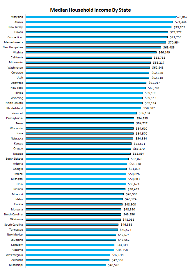
First, here’s a look at the median household income by state:

Maryland leads the way with a median household income above $76k, closely followed by Alaska ($74k) and New Jersey ($73k).
Mississippi ranks last with a median household income of just above $40k, with Arkansas ($42k) and West Virgina ($42k) only slightly higher.
Visualizing the Top 10%
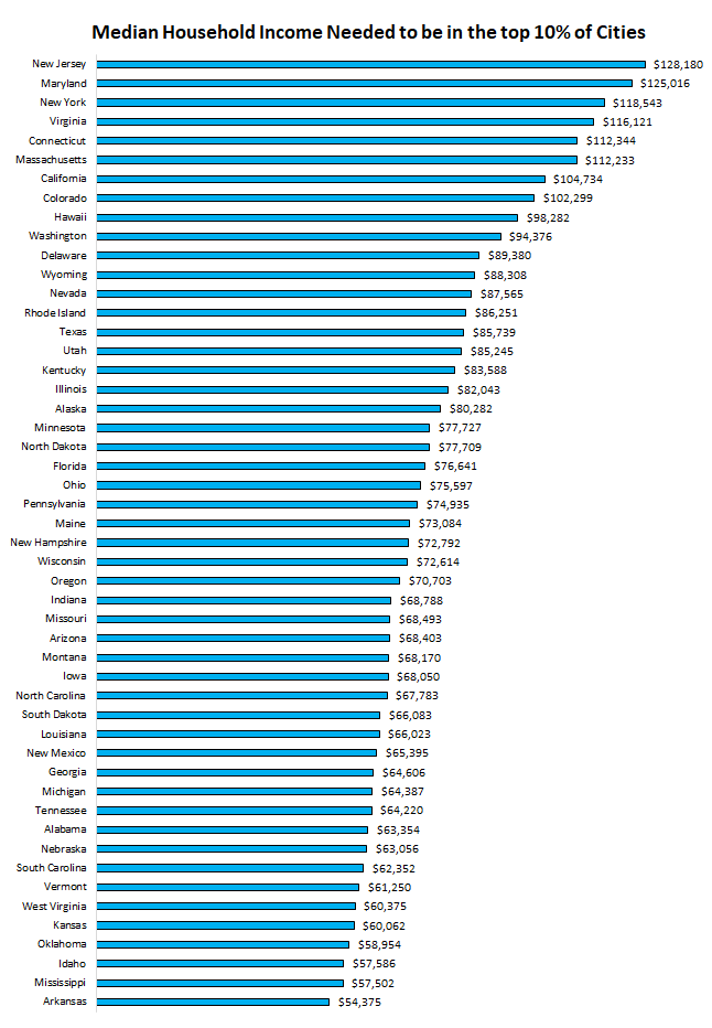
Next, I looked at the top 10% of median household income cities in each state:

How to interpret this chart: The cities in the top 10% of median household incomes in New Jersey all had a median household income of $128,180 or higher.
Visualizing the Bottom 10%
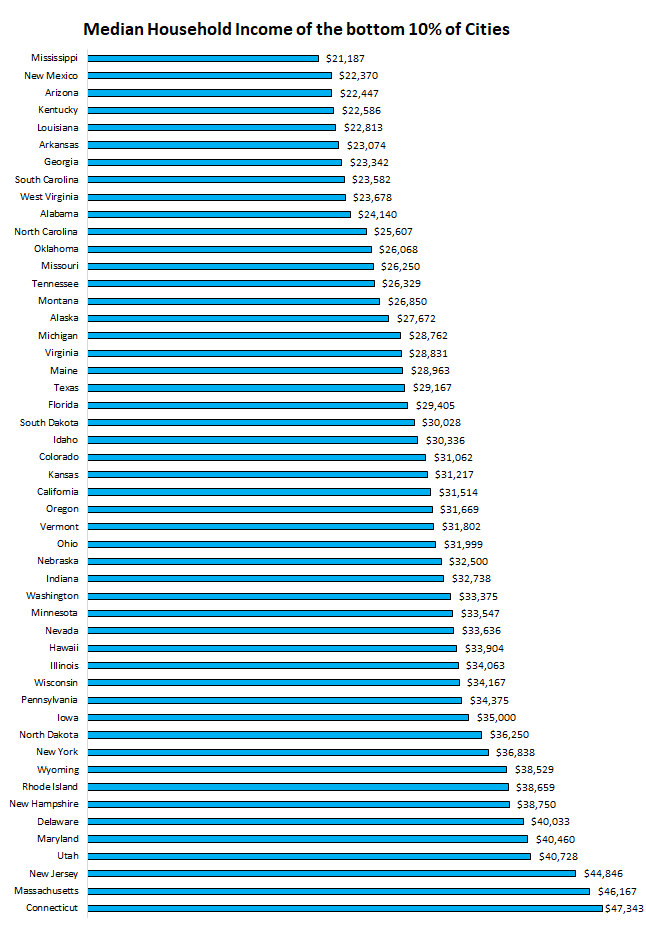
Then I looked at the bottom 10% of median household income cities in each state:

How to interpret this chart: The cities in the bottom 10% of median household incomes in Mississippi all had a median household income of $21,187 or lower.
Visualizing the Top 10% vs. the Bottom 10%
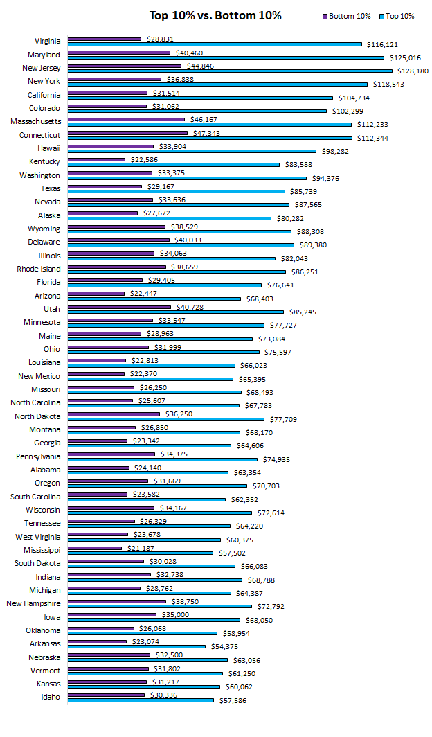
Lastly, I looked at the difference between the top 10% and the bottom 10% of median household income cities in each state:

Virginia had the greatest difference between the top 10% and bottom 10% of median household income cities with a difference of $87,290.
Idaho had the smallest difference with the top 10% and bottom 10% only being separated by $27,250.
Nerd Notes: The American Community Survey provided estimates on the median household income for each state in the U.S. as well as median household incomes for each individual city. To find the bottom 10% and top 10% of cities, I exported the data to R, where I found the household income quantiles for each state. I visualized the results using Excel. Later this week I’ll be sharing a post that shows household income data for 30,000+ individual cities in the U.S.
- The Ad Revenue Grid - August 6, 2021
- Attract Money by Creating Value for a Specific Audience - July 13, 2021
- The 5-Hour Workday - March 26, 2021
Full Disclosure: Nothing on this site should ever be considered to be advice, research or an invitation to buy or sell any securities, please see my Terms & Conditions page for a full disclaimer.

Hey Zach,
Great post – I especially think the final chart where you display the top 10% and bottom 10% is very useful! Especially with the increased discussion of rising inequality, comparing these two segments are going to be important moving forward. I thought I might leave a few comments on some of the charts to possibly improve the visualizations! (I have about 3 years of experience as an economist working with the ACS data – so these are all things I have done to help improve visualizations.)
1) It would be worthwhile to add the US median or mean on these charts (obviously dependent on what you are showing). Highlighting where this bar lands would be great to visually show how many states fall above or below this line.
2) In your final chart, just graphing the difference instead of the top and bottom percentiles would help display which states have the largest gap.
Love your site! Looking forward to your future posts.
Some surprises there – I am a bit surprised that Maryland ranks so highly for median and high income.
Are these figures before or after tax/benefits? I know that there are different tax rates applied by state in the US – so that might muddy the waters a bit.