3 min read
In statistics, there is a technique known as “clustering” that is used to identify groups of similar things.
Many companies use clustering to identify groups of consumers that behave similarly so that they can advertise to them more effectively. For example, a grocery store might identify three types of shoppers:
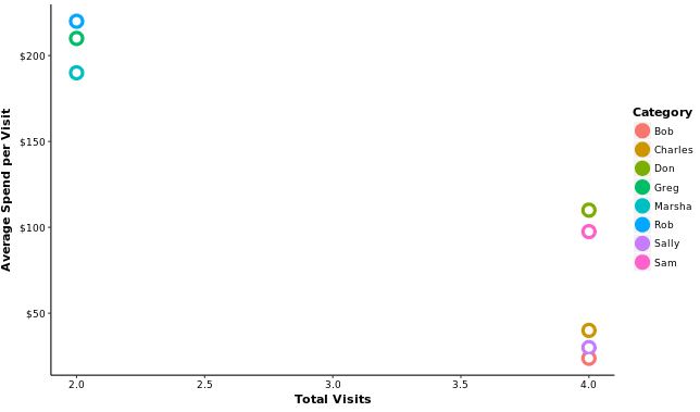
Frequent, low-volume shoppers: people who visit the store once per week but only spend $30 per visit
Frequent, high-volume shoppers: people who visit the store once per week and spend $100+ per visit
Infrequent, high-volume shoppers: people who only visit the store twice per month but spend $200+ per visit
Based on which group a shopper falls in, the grocery store may send them specific advertisements and coupons that will cater to their shopping style.
This is a simple way of “clustering” shoppers using two variables:
(1) Number of monthly store visits
(2) Dollars spent per visit
If we plot some individual shoppers on a graph, with total monthly store visits on the x-axis and average spend per visit on the y-axis, we can see these three distinct “clusters” emerge:

And in the same way that a grocery store may attempt to cluster individuals based on their shopping behavior, we could use a similar technique to cluster monthly expenses based on spending behavior.
To illustrate this, I went ahead and downloaded my credit card transactions from May, then made a similar graph that shows my spending behavior based on category.
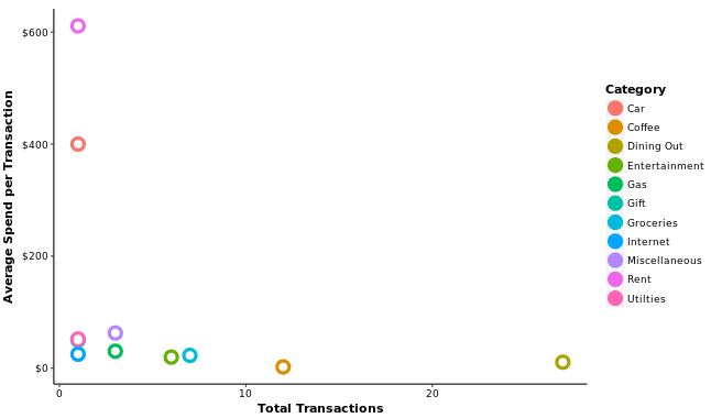
The x-axis shows how many total transactions I made per category and the y-axis shows my average spend per transaction:

Interestingly, I can see a few “clusters” in this graph as well:
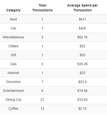
Infrequent, high-volume categories: This includes my rent and car payment. I only made one transaction for each, but the average spend for each was relatively high compared to the other categories.
Infrequent, low-volume categories: This includes utilities, internet, gas, and entertainment among others. I had between 1 – 10 transactions during May in each of these categories and the average spend was fairly low for each.
Frequent, low-volume categories: This includes coffee and dining out. In May, I dined out over 20 times and spent around $10 each time. I also got coffee 12 times and spent an average of about $2 each time.
This table shows the specific number of transactions and average spend per transaction for each category:

One benefit of looking at my monthly spending this way is being able to see how different categories impact my overall spending.
Specifically, I can see that my rent and my car payment/insurance account for a huge percentage of my monthly spending even though I only make those transactions once per month.
On the other hand, I can see that getting coffee and dining out were two categories I spent low amounts on frequently during May.
This chart also helps me see just how important it is to keep the “big” spending categories low. Since my housing and transportation only cost $1,000 per month total, I’m able to splurge a little more on things like coffee and Chipotle while still keeping my monthly spending fairly low.
For example, by only paying about $600 per month in rent I could eat Chipotle every single day, rack up $250 in “dining out” expenses, and still spend less than if I had opted to live in a $900-per-month apartment.
- The Ad Revenue Grid - August 6, 2021
- Attract Money by Creating Value for a Specific Audience - July 13, 2021
- The 5-Hour Workday - March 26, 2021
Full Disclosure: Nothing on this site should ever be considered to be advice, research or an invitation to buy or sell any securities, please see my Terms & Conditions page for a full disclaimer.

Good post. I’ve never thought about plotting my expenses this way. I think I’ll give it a try. Generally I’ve found, the more I document and track my spending habits, the less I tend to spend. So I guess that alone makes it a worthwhile activity.
-Ray
I do this all the time Zach and have for many years. It is a very effective means to understand spending and improve upon past trends. Tom