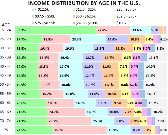
The above chart, using data from the U.S. Census Bureau, shows the distribution of individual income by age group in the U.S.
Some Interesting Observations
Half of all 15 – 24 year-olds earn less than $12.5k per year. Not much of a surprise considering most individuals in this age bracket are still in high school or college with part-time jobs.
Only 5.4% of 15 – 24 year-olds earn more than $50k per year. This percentage increases to 25.3% among 25-29 year-olds.
40 – 44 year-olds represent the age bracket with the highest percentage of individuals (56.3%) who earn over $50k per year.
50 – 54 year-olds have the highest percentage of individuals who earn $100k or more per year. Not much of a surprise either considering this is when earnings tend to peak in traditional jobs.
It’s interesting to see that in nearly every age group there’s a larger percentage of people who earn $100k per year than $75k – $100k per year.
In general, individual income tends to increase up to around age 40 – 54 before falling lower as age increases.
- The Ad Revenue Grid - August 6, 2021
- Attract Money by Creating Value for a Specific Audience - July 13, 2021
- The 5-Hour Workday - March 26, 2021
Full Disclosure: Nothing on this site should ever be considered to be advice, research or an invitation to buy or sell any securities, please see my Terms & Conditions page for a full disclaimer.

Nice chart! I’m loving all these visuals again. Very helpful.
Nice work, Zach. – Mike
Wow that’s kind of surprising to me to see how many people earn 100k+.
I’d love to see something like this broken out geographically.
Your HTML/JavaScript skill is amazing. Very nice graphics.
Thank you! Glad you liked the chart 🙂