4 min read
The S&P 500 is a stock market index that tracks the performance of 500 large U.S. companies. It’s Warren Buffett’s investment vehicle of choice for the average investor and it happens to be the only index I am investing all my 401(k) contributions in.
Related: Visualizing Every Stock in the S&P 500 as Tiny Circles
Today, I take an in-depth look at how the S&P 500 performed in 2017. I know we still have two more weeks until the year is over, but I thought this would be a fun analysis to do before the holidays hit.
Let’s jump in!
The Individual Stocks
There are 500 companies in the S&P 500, but some have more than one “class” of stock. For example, Under Armour has Class A and Class C stock shares. People who own Class A shares have voting rights, while those who hold Class C shares do not. If you’re actually curious about what that means you can check out this article.
In total, there are 505 individual stocks in the index.
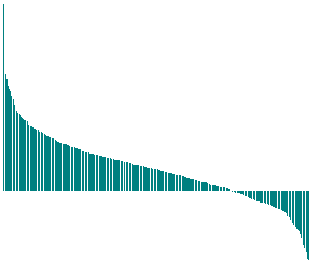
Here’s a bar chart that shows the individual returns of every stock in the index, in order from highest to lowest:
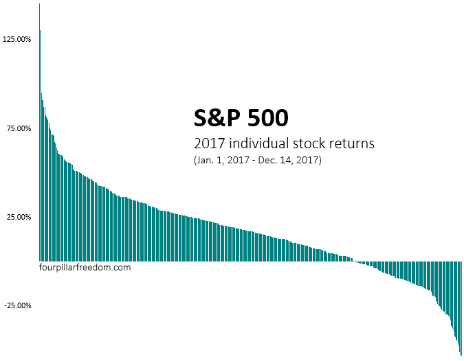
In total, the S&P 500 returned 18.46% this year. Although, as you can see, the individual stock returns within the index were all over the place.
The median return of these 505 stocks was 17.28%. This means half of the stocks had returns higher than 17.28%, while half had lower.
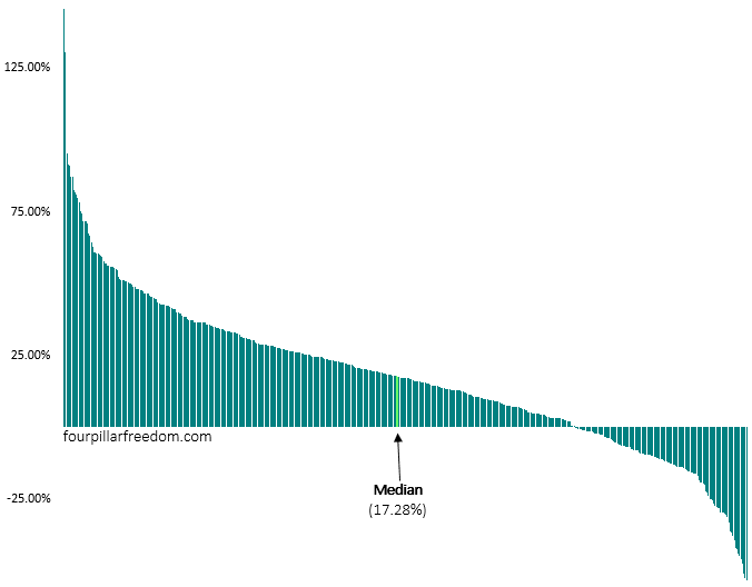
Fun fact: 53% of these individual stocks under-performed the index. This means if you randomly selected one of these 505 stocks at the beginning of the year, the odds were against you for outperforming the index.
To me, the most incredible insight from this chart is seeing that over one-fourth of all the stocks actually had negative returns this year:
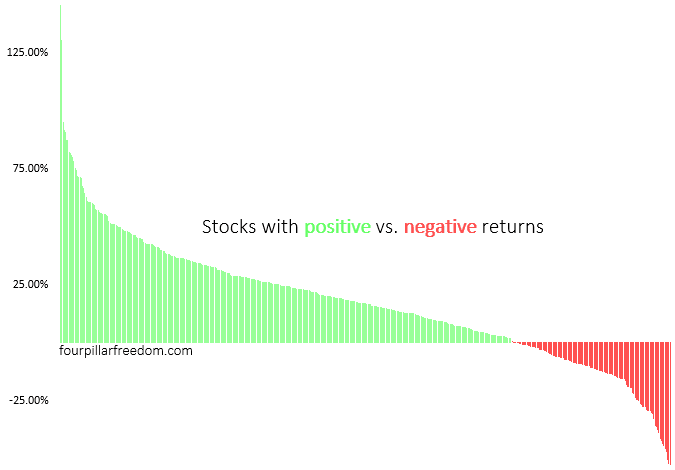
That’s pretty insane.
In a year with incredible stock market gains, one out of every four stocks was a losing investment.
If we zoom in, we can see specifically which stocks were the biggest losers this year:
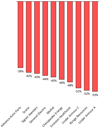
The biggest loser was Under Armour, which ironically had been one of the best performing stocks in the years leading up to 2017:
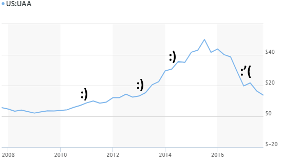
Unfortunately, this is the nature of individual stocks. The winners can turn into losers in one year.
There were also some extreme winners in 2017. Let’s zoom in on those stocks:
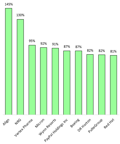
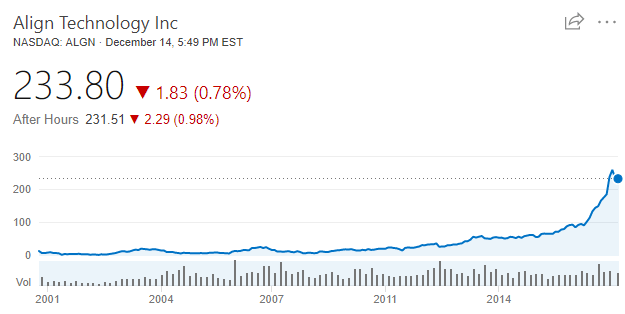
The biggest winner was Align technology, with an incredible 145% return this year. But don’t kick yourself for not owning this stock. Virtually no one could have predicted it’s sudden rise in price this year. It had been a lousy investment for the 15 years prior:
Why the S&P 500 is so Hard to Beat
The S&P 500 is hard to beat because almost every year there are a few extreme winners. These extreme winners help cancel out the losers and pull the entire index higher.
It’s incredibly difficult to predict which companies within the S&P 500 will have a breakout performance from one year to the next, but as long as you hold the entire index you’re guaranteed to own those companies.
Consider this thought experiment. Let’s divide up all the individual stock returns from 2017 into four groups: “Incredible”, “Good”, “OK”, and “Bad”.
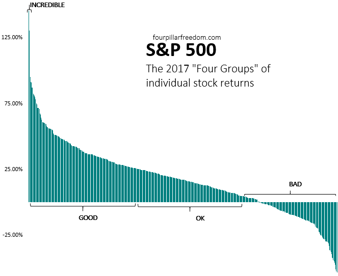
The “incredible” stocks were the two stocks with over 100% returns for the year. I like to think of these as “extreme winners.”
The “good” stocks had returns between 26% and 95%. These stocks were in the top third of returns.
The “OK” stocks had returns between 6% and 26%. These stocks were in the middle third of returns.
The “bad stocks” had returns below 6%. These stocks were in the bottom third of returns.
Imagine you reach into a bag filled with 505 strips of paper. Each strip has the name of a stock on it.
The probability that you pick a “bad” stock is about 33%. The probability that you pick an “OK” stock is also about 33%. The probability that you pick a “good” stock is also about 33%. But the probability that you pick an “incredible” stock is less than 1%.
The Danger of Individual Stocks
This experiment illustrates what it’s like to be an individual stock picker. Sure, you might pick a good stock. The problem is, you’re equally likely to pick a bad stock. The odds that you pick an incredible stock are unbelievably slim.
You might say to yourself “Picking stocks isn’t like randomly picking strips of paper out of a bag. I know which stocks are good, so I would only pick those ones.” The problem with this logic is that you can’t possibly know which stocks will be “good” from one year to the next.
Think of all the well-known stocks people thought would be good, but actually got slaughtered this year: Kroger, CVS, Foot Locker, General Electric, Chipotle, Target, and the list goes on.
Would you really have picked the “good stocks” this year? Some of the best stocks this year were ANSYS, FMC, Cigna, Albemarle, and Aptiv. Have you heard of any of those companies?
This is why the S&P 500 is such a powerful investment vehicle. It doesn’t attempt to pick the winners and losers. It simply holds a little piece of each company. By doing so, it gets the “good”, “OK”, “bad”, and “incredible” stocks. Sometimes the bad stocks cancel out the good ones, but the incredible stocks pull everyone higher.
Hopefully you enjoyed this little analysis. Thanks for reading 🙂
- The Ad Revenue Grid - August 6, 2021
- Attract Money by Creating Value for a Specific Audience - July 13, 2021
- The 5-Hour Workday - March 26, 2021
Full Disclosure: Nothing on this site should ever be considered to be advice, research or an invitation to buy or sell any securities, please see my Terms & Conditions page for a full disclaimer.

Very interesting, nice work!
Would be curious to see a similar analysis on VTSAX…
Thanks, Scott! I actually wanted to do an analysis for VTSAX but I haven’t been able to find data for the individual stock returns in the index anywhere online…if I do manage to find the data I’ll definitely do a similar analysis!
Love the visuals, really helps hammer home how risky it is to try and pick stocks. Like you, I’d much rather own the whole index to ensure that I capture the winners.
Agreed with Matt on the visuals. Some of your charts and the overall quality of the data presented is very helpful. Thanks again for the posts.
Thank so much, Mike!
Index investing for the win!