Here are two interactive tools to compare savings and investment returns…
Category: Pillar IV: Finance
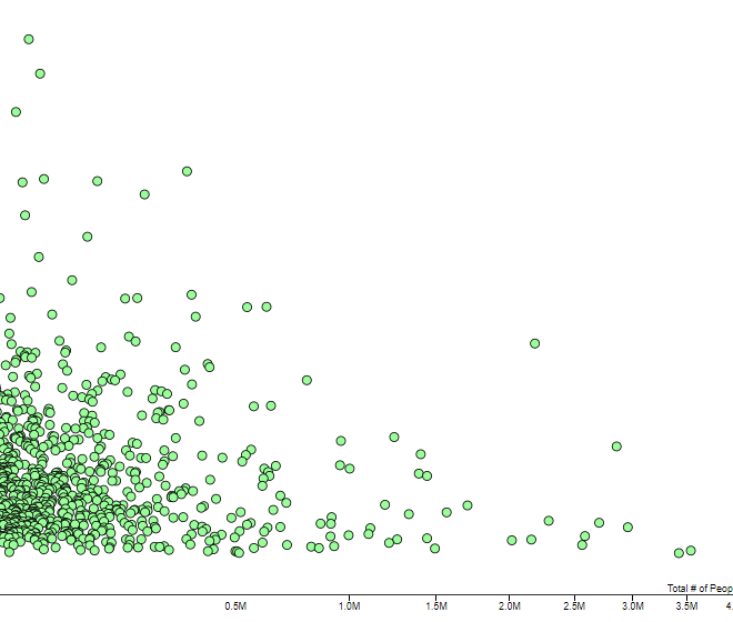
This chart shows the average annual salary and total employment of 820 different occupations in the U.S.
This calculator finds equivalent savings plans based on yearly savings and investment returns…
In this analysis I explore how different amounts of savings have historically grown over time without additional yearly contributions…
Traditional retirement advice says you need to save 25 times your annual expenses before you retire. Here’s how a “25 times expenses” portfolio has performed over time…
Here’s why it’s important to understand power law distributions…
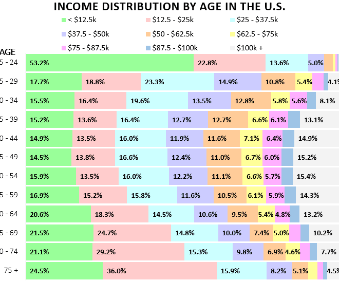
This chart shows the distribution of individual income by age group in the U.S.
Here’s the magic of increasing how much you invest each year…
There’s a reason I’m sticking it out in Corporate America for a bit longer: my money machine isn’t strong enough to grow substantially on it’s own yet…
I went back and looked at yearly S&P 500 returns since 1950 to find out just how long it took to save $1 million based on different yearly savings amounts…
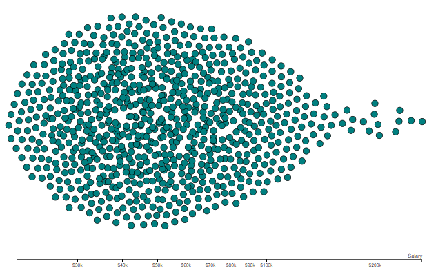
This chart shows the average annual salary of 820 different professions in the U.S.
Today I explore the math that explains why net worth begins to take off like a rocket ship after crossing the $100k threshold…
Here’s a detailed description of how I manage my money…


